In This Article
SHARE



Do You Have An Interesting Project?
Introduction
The first thing most founders do after seeing a Sharetribe demo is Google "can Sharetribe be customised."
The default template looks functional. It also looks generic — like every other Sharetribe marketplace. Same layout, same listing cards, same search interface. If your marketplace is going to build trust with users, that needs to change.
The answer to how much can be customised is: almost everything visible to the user. The Sharetribe backend handles listings, payments, transactions, and messaging. The frontend — every page your users actually see — is a React-based web template that icodelabs can redesign completely.
This guide explains what customisation looks like at each level, with real examples from icodelabs builds that are live today.
What Stays the Same
Before covering what changes, it is worth being clear about what does not.
The Sharetribe backend infrastructure — how listings are stored, how transactions process, how Stripe Connect handles payments — is managed by Sharetribe and is not something you customise visually. This is actually an advantage: it means you get a stable, proven backend and spend your budget on the parts users interact with.
What you are customising is the frontend: every page, every component, every interaction that a buyer or seller sees.
Two Tiers of Customisation
Not every marketplace needs a complete ground-up redesign. icodelabs approaches Sharetribe UI/UX work across two clear tiers based on what the marketplace actually needs.
Basic Customisation — Branding and Homepage
Basic customisation is the right starting point for marketplaces that want a professional, on-brand appearance without redesigning every page from scratch.
The Sharetribe template ships with sensible defaults for listing pages, search, and checkout. With basic customisation, these pages are updated to match a consistent brand identity — colours, typography, spacing, and logo — without restructuring their layout or UX.
The homepage, however, is rebuilt entirely. The default Sharetribe homepage is minimal and does not communicate what a marketplace does, who it is for, or why a user should trust it. A custom homepage with a clear hero section, featured listings, category navigation, and trust signals makes the difference between a marketplace that converts and one that does not.
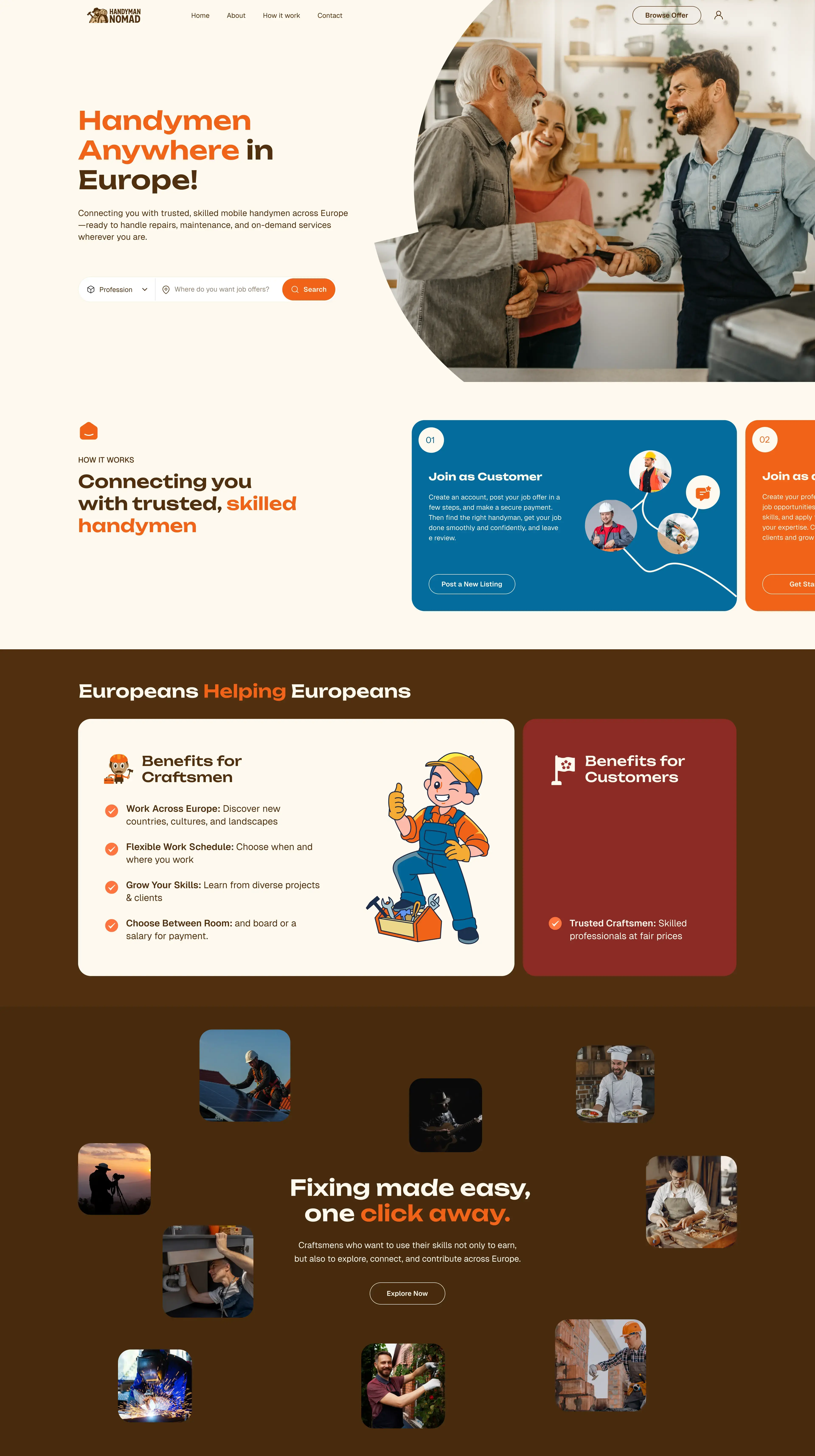
Handyman Nomad
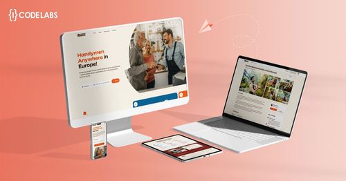
Handyman Nomad is a service marketplace connecting tradespeople with homeowners. The homepage is built around a dual-role entry point — visitors immediately self-identify as a homeowner looking for a tradesperson or a professional looking for work, and are taken down the right path from the first second.
The map view and carousel on the homepage give the platform a live, location-aware energy that the default template could never achieve. The overall aesthetic positions Handyman Nomad as a trusted professional community rather than a gig platform.
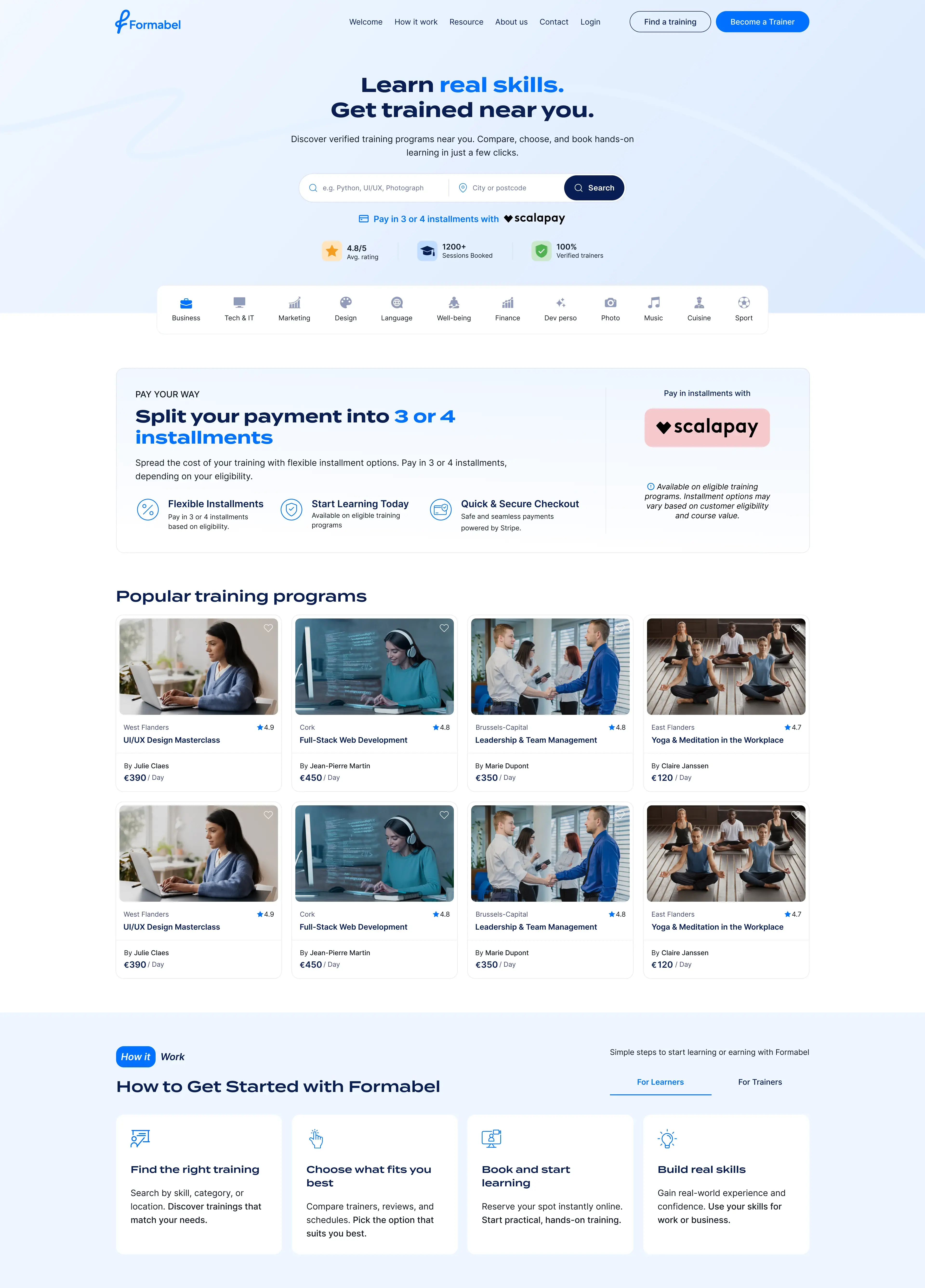
Formabel
Formabel is a Belgian French-language training marketplace. The design is clean, corporate, and immediately communicates professional credibility — important for a marketplace where companies are purchasing training for their employees.
The homepage is structured around course categories and featured providers, with Belgian VAT and compliance cues visible in the right places. It looks nothing like a default Sharetribe marketplace, but all the changes are at the homepage and branding level.
Advanced Customisation — Full Vertical-Specific Redesign
Advanced customisation is for marketplaces where the default template UX does not fit the vertical — where listing cards, search filters, the booking flow, or user dashboards need to be rebuilt for how the specific marketplace actually works.
This is where the gap between a Sharetribe marketplace and a custom-built marketplace effectively disappears from the user's perspective. Every page is redesigned for the niche. The platform feels purpose-built.
What gets redesigned at advanced level
Listing cards — the default listing card is a generic image-title-price format. For a music gear marketplace it might show condition, brand, and location. For an edtech marketplace it might show course duration, level, and instructor credentials. The card is redesigned to surface the information that matters for that vertical.
Search and filters — the default search is keyword-based with basic filters. Advanced customisation rebuilds the filter interface for the specific marketplace: gear type and brand for music, subject and age group for tutoring, location and availability for rentals.
Listing detail pages — the default layout is image, title, description, booking widget. A redesigned listing page might have a photo gallery, a structured specifications section, a trust-signal panel, and a custom booking widget that matches the transaction model.
Provider dashboards — sellers and service providers need dashboards that match how they actually manage their business on the platform. This might include earnings views, booking calendars, review summaries, or listing performance data — none of which exist in the default template.
Buyer dashboards — similarly, buyer dashboards can be rebuilt to show booking history, favourite providers, saved listings, and active transactions in a way that makes sense for the vertical.
Onboarding flows — the default signup and listing creation flows are generic. Advanced customisation rebuilds these with vertical-specific steps, validation, and guidance that makes providers confident they are setting up correctly.
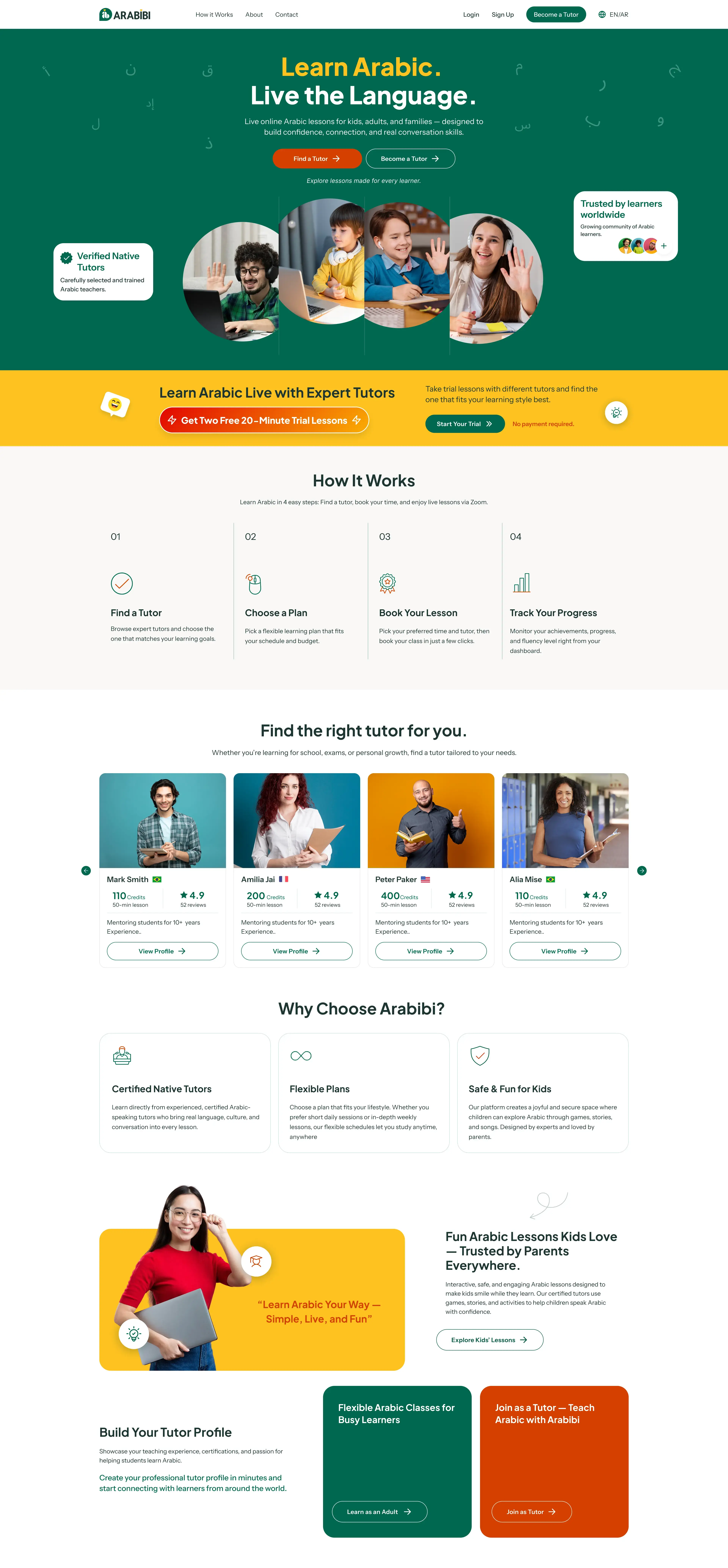
Arabibi
Arabibi is an edtech marketplace connecting students with tutors across the Arab world. The design is warm, accessible, and child-friendly — the visual identity communicates trust to both parents and students immediately.
Every page is redesigned for the tutoring vertical. Tutor listing cards show subject, level, hourly rate, and a session count. The search interface filters by subject, age group, and availability. The booking flow is structured around session scheduling rather than a generic checkout.
The dashboard gives students visibility of upcoming sessions, progress, and their credit balance — Arabibi uses a credit wallet system that the default Sharetribe template has no concept of.
This is what it means for a marketplace to feel purpose-built. Nothing in the design suggests it was built on a template.
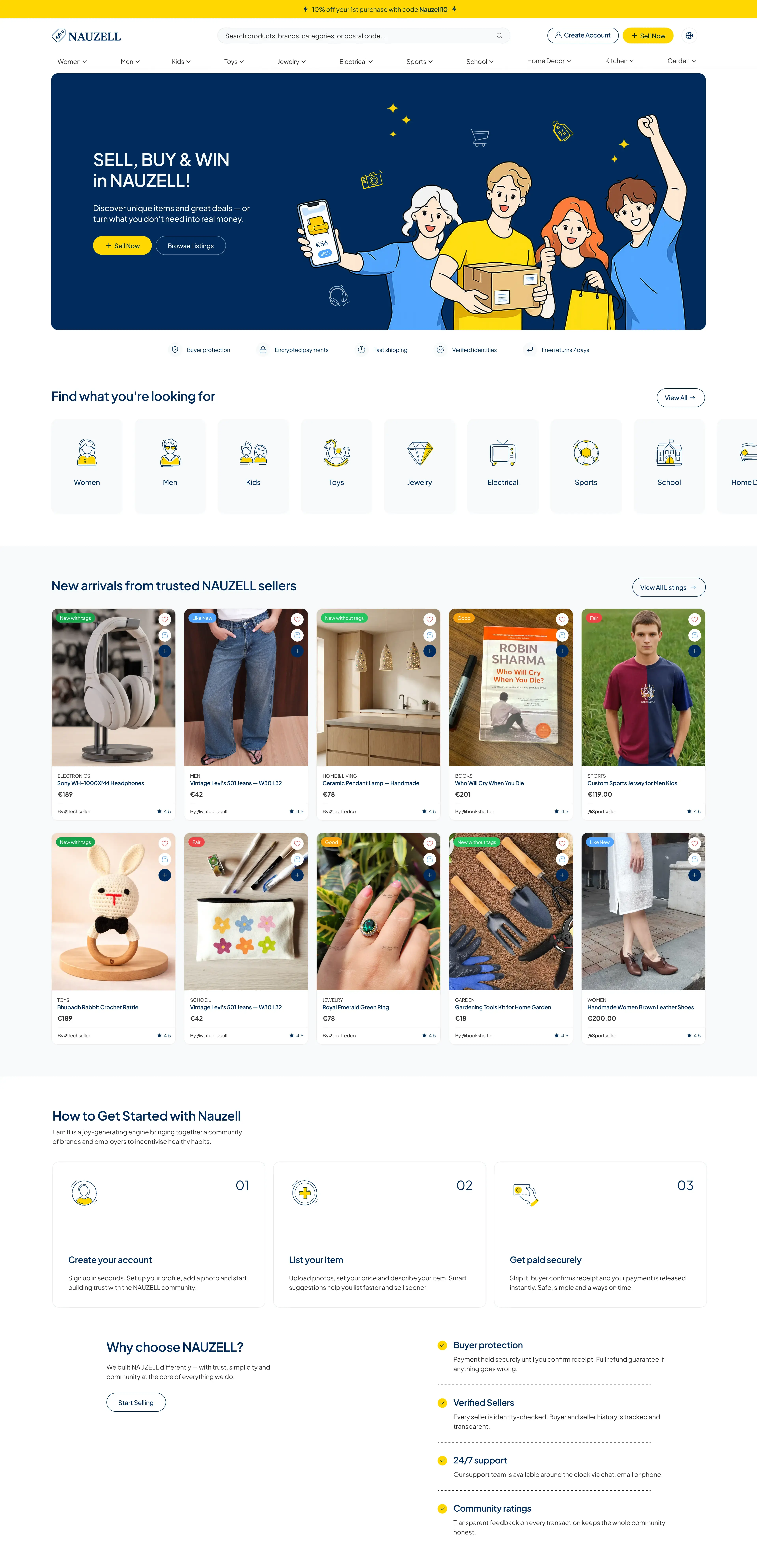
Nauzel
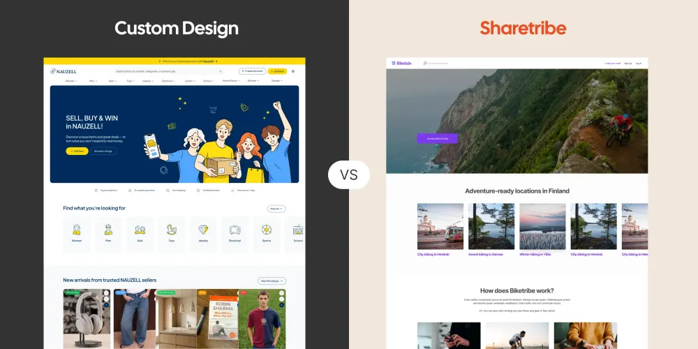
Nauzel (NAUZELL) is a Vinted-style second-hand marketplace launching across Australia, New Zealand, and Canada simultaneously. Buyers and sellers trade clothing, electronics, books, school uniforms, toys, and home décor — with the platform automatically routing each user to their country, displaying local currency, and connecting sellers to local shipping carriers.
The design takes its visual cues from Vinted's clean, product-first aesthetic and applies NAUZELL's own brand identity on top. Every public-facing page has been designed in Figma before a single line of development code was written — homepage, search and listing results, and individual listing pages all custom-built. The remaining pages follow the same branding consistently within the Sharetribe template structure.
What makes the design distinctive is how much complexity it hides. The platform supports multi-country inventory filtering, a make-an-offer negotiation system, bundle creation across multiple items, verification badges, and a custom dual-fee commission model — yet none of this complexity surfaces in the UI. The browsing and listing experience is as clean and simple as a consumer fashion app.
Groovebay
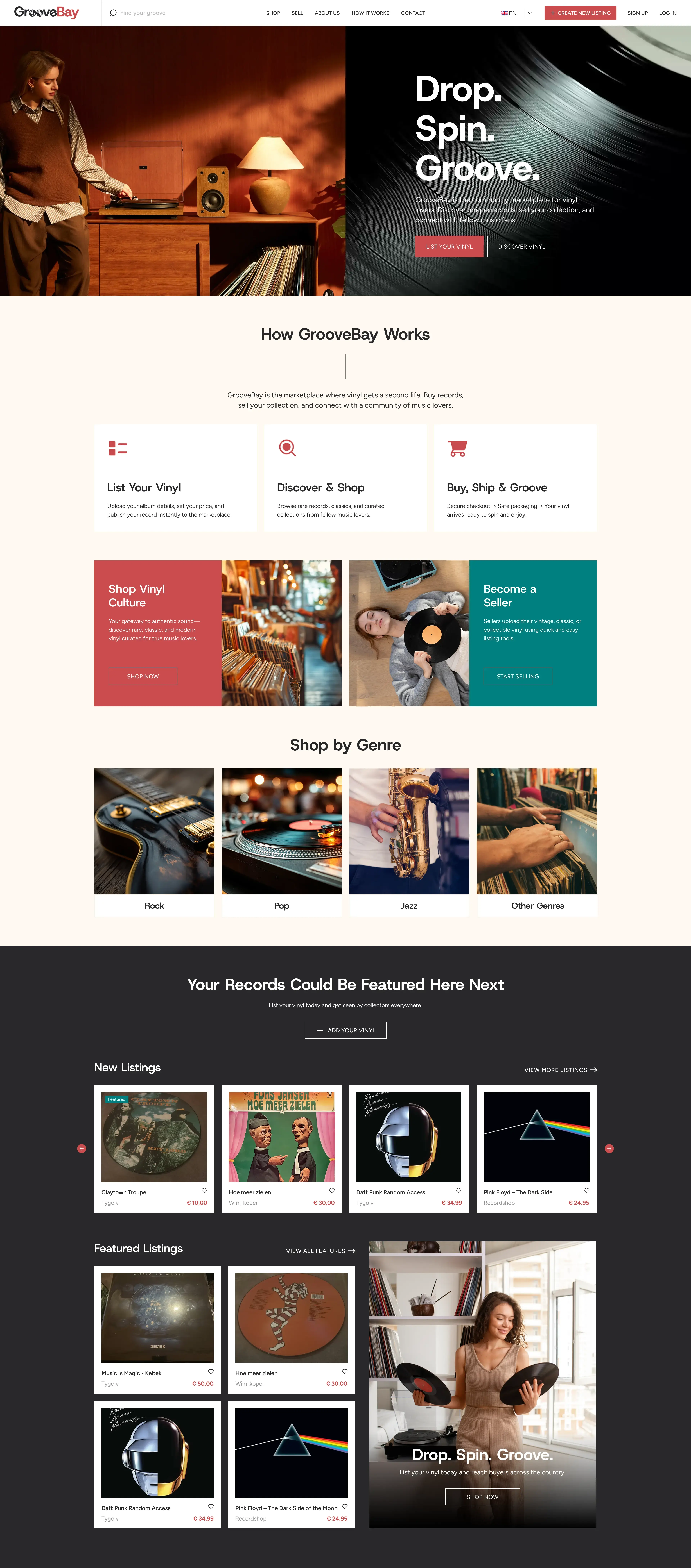
Groovebay is a Dutch music gear marketplace — instruments, equipment, and accessories bought, sold, and auctioned between musicians. The design reflects the marketplace's audience: creative, tactile, community-driven.
The listing cards show gear condition, brand, and location prominently. The bidding interface — Groovebay supports auction-style listings — is custom-built and integrated into the Sharetribe transaction flow. The search filters are structured around the way musicians actually search for gear: by instrument type, brand, condition, and price range.
ReParty
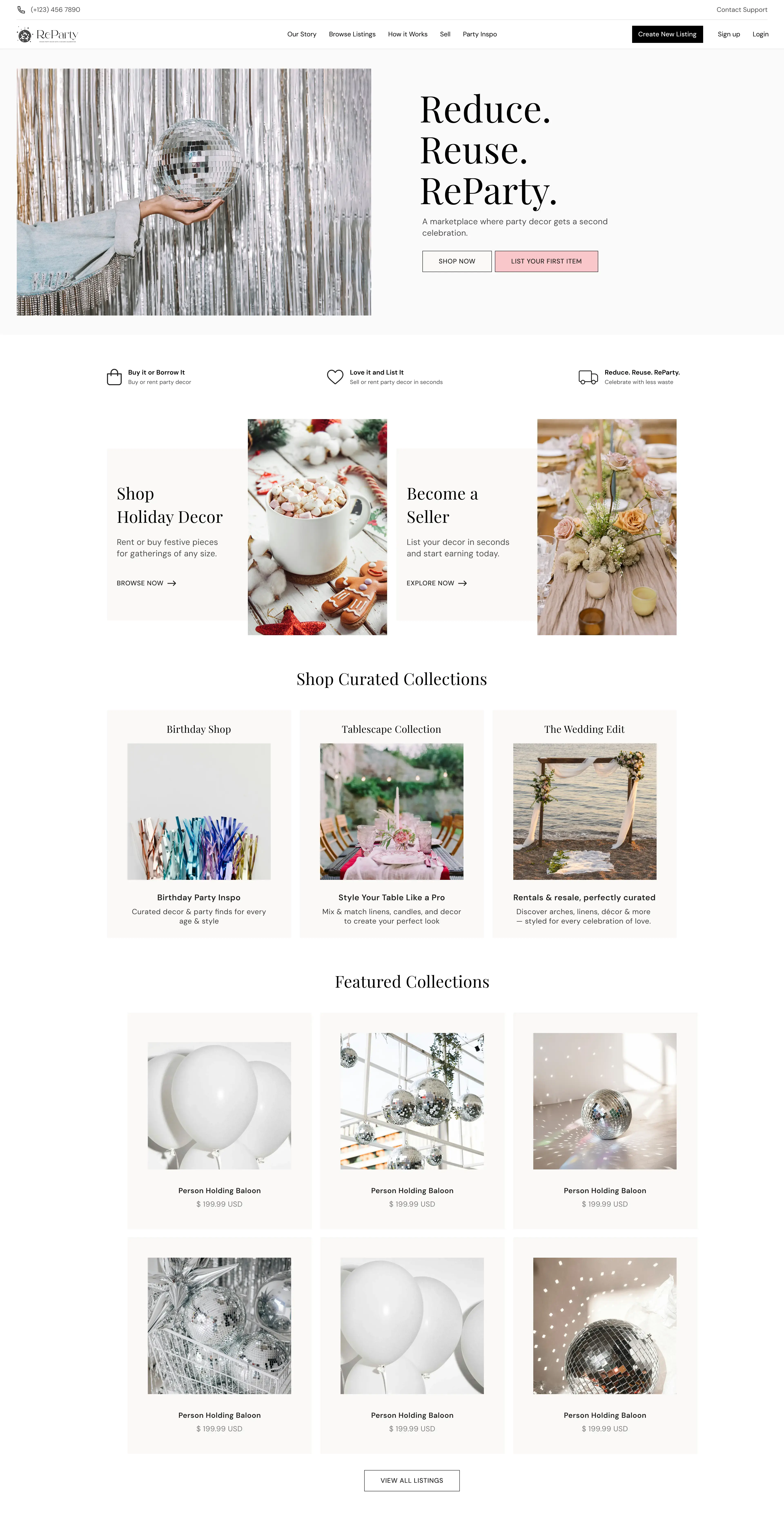
ReParty is a US-based peer-to-peer marketplace for party decor — buyers can purchase items outright or rent them for a specific period, from the same listing. The design is editorial and aspirational: Playfair Display paired with DM Sans, a palette of blush, black, and warm neutrals, photography-led layouts that feel like a lifestyle brand rather than a classifieds marketplace.
This is one of the clearest demonstrations of what advanced Sharetribe UI customisation achieves. Nothing in the visual design suggests the platform is built on a marketplace template. The homepage, listing pages, and checkout flow all reflect ReParty's brand identity — sustainable, celebratory, community-driven — rather than the generic Sharetribe default.
The design challenge here was particularly interesting: supporting two fundamentally different transaction types — sale and rental — within a single listing, without making the buying experience feel complicated. The UI handles this cleanly, letting buyers choose their transaction type without confusion.
The full case study is available at icodelabs.co/casestudy/reparty.
How icodelabs Approaches Sharetribe Design
Most Sharetribe developers approach design as an afterthought — apply a colour palette to the default template and call it done. icodelabs approaches it differently.
Design before development
Every advanced customisation starts with visual prototyping before any code is written. The team uses Claude artifacts and Figma to produce interactive mockups of key pages — homepage, listing card, listing detail, and dashboards — so founders can see and approve the design before development begins.
This eliminates the most common and expensive problem in marketplace builds: discovering a design misalignment after weeks of development. Changes at the prototype stage take hours. Changes after development takes weeks.
Designed for the vertical
A rental marketplace should look nothing like an edtech marketplace. The visual language, the information hierarchy, the trust signals, the booking flow — all of these should reflect how users in that specific vertical think and make decisions.
icodelabs designs each marketplace for its specific users, not from a generic template that gets colour-swapped.
Consistent design system
Advanced customisations produce a complete design system — a set of reusable components, colour tokens, and typography rules that ensure the marketplace looks consistent across every page. This also makes future development significantly faster: new pages and features are built using the same system, not designed from scratch each time.
Which Tier Is Right for Your Marketplace
Basic customisation is the right choice if:
- You are launching an MVP and want to validate demand before investing in full design
- Your marketplace fits the default template UX well — the structure works, it just needs to look like your brand
- Budget is a constraint and you plan to upgrade the design after traction Advanced customisation is the right choice if:
- The default template UX does not match how your users need to interact with the marketplace
- You are entering a market where user trust and visual credibility are essential from day one
- You have specific dashboard, search, or listing requirements that the default template cannot accommodate
- You are building for a niche where the platform feeling purpose-built is part of the value proposition
Final Thoughts
The Sharetribe template is a starting point, not a ceiling.
Every marketplace icodelabs has delivered on Sharetribe looks different — because every marketplace serves different users with different needs. The platform is the same underneath. The experience is completely different on top.
If you have looked at the default Sharetribe template and thought it cannot look like what you have in mind, the answer is that it can. The question is how much of the design work is worth investing in before launch.
If you are unsure which tier fits your marketplace, book a free 30-minute scoping call. We will look at your requirements and tell you honestly what level of customisation makes sense for where you are.
FAQ
Can Sharetribe be fully redesigned visually?
Yes. The Sharetribe web template is a React-based frontend that icodelabs can redesign completely — homepage, listing pages, search, checkout, dashboards, and every other page. The visual output is limited only by design decisions, not by the platform.
Does customising the Sharetribe template affect platform updates?
Yes — heavier customisations require more careful management of template updates. icodelabs structures customisations to keep the core template as clean as possible, reducing the maintenance overhead of future updates.
How long does a basic branding customisation take?
Typically 1–2 weeks. A full advanced redesign including all pages and custom dashboard views takes 4–6 weeks depending on scope.
What is the difference between Basic and Advanced customisation?
Basic customisation covers branding and homepage — colours, typography, logo, hero section, and consistent styling across existing template pages. Advanced customisation rebuilds the UX of every page for a specific vertical — custom listing layouts, niche search filters, branded onboarding flows, and fully redesigned dashboard views.
Do I need a designer before approaching icodelabs?
No. icodelabs handles design in-house using Claude artifacts and Figma for visual prototyping. Founders provide direction and brand references; the team handles the design and implementation. Development begins only after design sign-off.
Can I see what my marketplace will look like before development starts?
Yes. icodelabs produces visual prototypes — using Claude artifacts and Figma mockups — of key pages before any code is written. This ensures the design is exactly what you want before the build begins.
Which Sharetribe pages can be customised?
All of them. Homepage, listing cards, listing detail pages, search results, filters, checkout flow, user profiles, provider dashboards, buyer dashboards, onboarding flows, email templates, and custom landing pages for SEO.